Select
A component that allows users to select a value from a list of options.
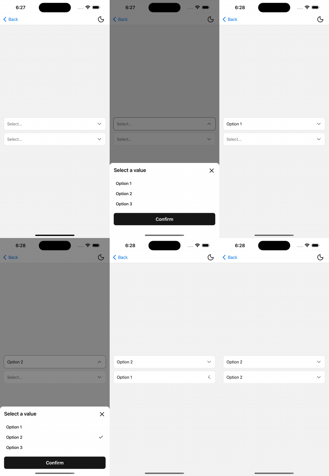
Installation
npx shadcn@latest add @tetra-ui/selectUsage
First ensure that you have the PortalHost component in your root layout.
import { PortalHost } from "@/components/ui/portal";

export default function RootLayout() {
  return (
    <>
      <Stack />
      <PortalHost />
    </>
  );
}
import { Button } from "@/components/ui/button";
import {
Select,
SelectContentSheet,
SelectContentSheetBody,
SelectContentSheetConfirm,
SelectContentSheetFooter,
SelectContentSheetHeader,
SelectContentSheetTitle,
SelectInput,
SelectItem,
SelectItemIndicator,
SelectItemLabel,
SelectTrigger,
} from "@/components/ui/select";
const OPTIONS = [
  { label: "Option 1", value: "1" },
  { label: "Option 2", value: "2" },
  { label: "Option 3", value: "3" },
];

<Select options={OPTIONS} placeholder="Select...">
  <SelectTrigger asChild>
    <SelectInput />
  </SelectTrigger>
  <SelectContentSheet>
    <SelectContentSheetHeader>
      <SelectContentSheetTitle>Select a value</SelectContentSheetTitle>
    </SelectContentSheetHeader>
    <SelectContentSheetBody>
      {OPTIONS.map((option) => (
        <SelectItem
          key={option.value}
          label={option.label}
          value={option.value}
        />
      ))}
    </SelectContentSheetBody>
    <SelectContentSheetFooter>
      <SelectContentSheetConfirm asChild>
        <Button>Confirm</Button>
      </SelectContentSheetConfirm>
    </SelectContentSheetFooter>
  </SelectContentSheet>
</Select>
Controlled
Pass value and onValueChange for controlled selection:
const [value, setValue] = useState<string>();

<Select
  options={OPTIONS}
  value={value}
  onValueChange={setValue}
  placeholder="Select..."
>
  {/* ... */}
</Select>
Invalid
Pass invalid to show a destructive border on the trigger input:
<Select options={OPTIONS} invalid placeholder="Select...">
  {/* ... */}
</Select>
Popover content
For shorter option lists, use SelectContentPopover instead of a sheet:
<Select options={OPTIONS} placeholder="Select...">
  <SelectTrigger asChild>
    <SelectInput />
  </SelectTrigger>
  <SelectContentPopover>
    {OPTIONS.map((option) => (
      <SelectItem
        key={option.value}
        label={option.label}
        value={option.value}
      />
    ))}
  </SelectContentPopover>
</Select>
When using popover content, PortalHost must be present in your root layout.
API Reference
Select
Root selection and open state. Value type is string | number.
Prop
Type
SelectTrigger
Extends React Native Pressable props. Toggles open and records trigger layout for popover positioning. Must be used within Select.
Prop
Type
SelectInput
Accepts partial ActionInput props. Shows the selected option label, placeholder, chevron, and focus/disabled/invalid from Select context. Must be used within Select.
SelectItem
Extends React Native Pressable props except onPress (managed). In popover mode, press commits immediately; in sheet mode, press updates the draft selection. Must be used within Select.
Prop
Type
SelectItemLabel
Extends Text props.
SelectItemIndicator
Renders a check icon when the item matches the draft selection. Must be used within SelectItem.
SelectContentSheet
Renders options in a BottomSheet. Sheet open state is bound to Select; dismiss cancels the draft.
SelectContentSheetHeader
Alias of BottomSheetHeader.
SelectContentSheetTitle
Alias of BottomSheetTitle.
SelectContentSheetBody
Alias of BottomSheetBody.
SelectContentSheetFooter
Alias of BottomSheetFooter.
SelectContentSheetConfirm
Extends React Native Pressable props. Commits the draft selection and closes the sheet. Must be used within Select.
Prop
Type
SelectContentPopover
Accepts PopoverContent props. Renders options in a popover (requires PortalHost). Selecting an item commits immediately.
Prop
Type
Changelog
2026-07-08 - Migrate BottomSheet to Expo UI
- The Select Sheet now uses the new
BottomSheetcomponent from Expo UI.
2026-05-30 - Migrate to BottomSheet
Use the new BottomSheet component for the sheet content instead of the NativeSheet component.