Badge
Displays a badge.
Installation
npx shadcn@latest add @tetra-ui/badgeUsage
import { Badge, BadgeIcon, BadgeText } from "@/components/ui/badge";
import { BadgeCheckIcon } from "@/components/ui/icons";<Badge>Badge</Badge>Variants
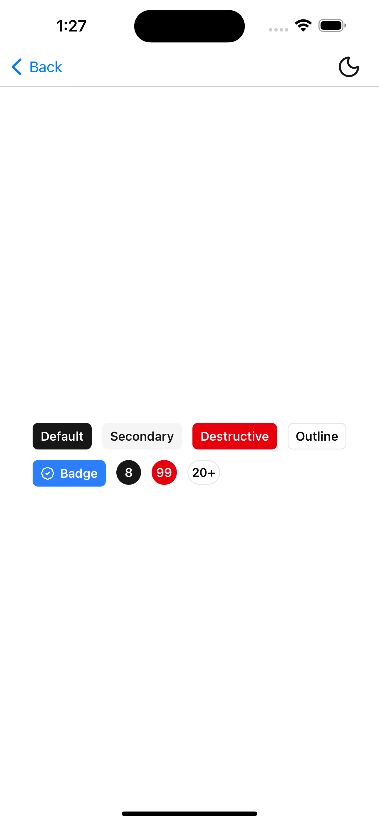
Use the variant prop to change the visual style:
<Badge variant="default">Default</Badge>
<Badge variant="secondary">Secondary</Badge>
<Badge variant="destructive">Destructive</Badge>
<Badge variant="outline">Outline</Badge>
With icon
Compose BadgeIcon and BadgeText for badges that include an icon:
<Badge variant="default">
  <BadgeIcon>
    <BadgeCheckIcon />
  </BadgeIcon>
  <BadgeText>Verified</BadgeText>
</Badge>
Count badge
Apply custom sizing classes to create compact count indicators:
<Badge className="h-7 min-w-7 rounded-full px-1 py-0.5" variant="destructive">
  99
</Badge>
API Reference
Badge
Extends React Native View props. String children are wrapped in BadgeText automatically.
Prop
Type
BadgeText
Renders badge label text styled from the parent Badge context.
Prop
Type
BadgeIcon
Clones a single child icon with size and color from the parent Badge context.
Prop
Type