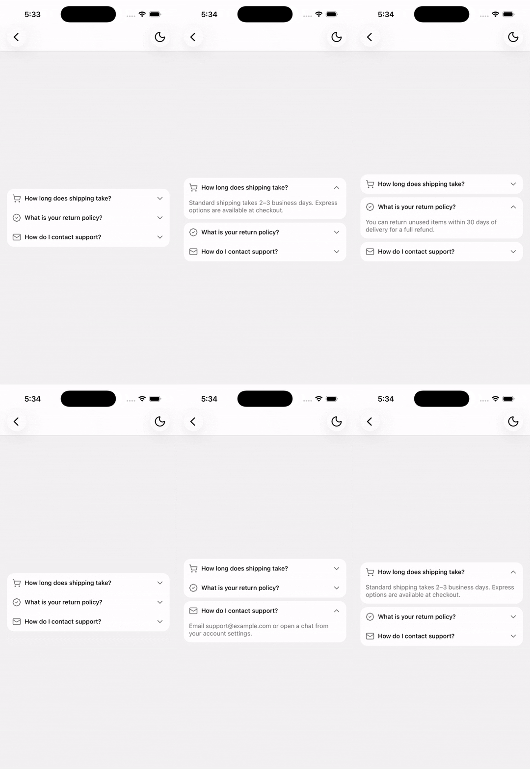
Accordion
A vertically stacked set of interactive headings that reveal associated content sections.
Installation
npx shadcn@latest add @tetra-ui/accordionUsage
import {
  Accordion,
  AccordionContent,
  AccordionIndicator,
  AccordionItem,
  AccordionTrigger,
} from "@/components/ui/accordion";
import { ShoppingCartIcon } from "@/components/ui/icons";
import { Stack } from "@/components/ui/stack";
import { Text } from "@/components/ui/text";<Accordion type="single" collapsible defaultValue="shipping">
<AccordionItem value="shipping">
<AccordionTrigger>
<Stack className="flex-1 items-center" direction="row" gap="sm">
<ShoppingCartIcon className="size-5 text-muted-foreground" />
<Text className="flex-1 font-medium">Shipping information</Text>
</Stack>
<AccordionIndicator />
</AccordionTrigger>
<AccordionContent>
<Text className="text-muted-foreground">
Orders ship within 2–3 business days.
</Text>
</AccordionContent>
</AccordionItem>
<AccordionItem value="returns">
<AccordionTrigger>
<Text className="flex-1 font-medium">Return policy</Text>
<AccordionIndicator />
</AccordionTrigger>
<AccordionContent>
<Text className="text-muted-foreground">
Returns are accepted within 30 days of delivery.
</Text>
</AccordionContent>
</AccordionItem>
</Accordion>Single vs multiple
Use type="single" (default) to allow one open section at a time, or type="multiple" to allow several sections open at once:
<Accordion type="multiple" defaultValue={["notifications", "privacy"]}>
  {/* ... */}
</Accordion>
Collapsible
When type is single, set collapsible to allow closing the active item so none remain open:
<Accordion type="single" collapsible>
  {/* ... */}
</Accordion>
Controlled
Pass value and onValueChange for controlled state:
const [value, setValue] = useState<string | undefined>("shipping");

<Accordion
  type="single"
  collapsible
  value={value}
  onValueChange={setValue}
>
  {/* ... */}
</Accordion>
Custom trigger
Use asChild on AccordionTrigger to compose with other pressable components:
<AccordionTrigger asChild>
  <Button variant="ghost" className="w-full justify-between">
    <ButtonText>Custom trigger</ButtonText>
    <AccordionIndicator />
  </Button>
</AccordionTrigger>
Spacing
Closed items that sit next to each other are visually grouped with no gap between them. When an item opens, it separates from its neighbors with vertical spacing so the expanded content reads as its own card.
API Reference
Accordion
Root open/closed state provider.
Prop
Type
AccordionItem
Extends React Native View props. Must be used within Accordion.
Prop
Type
AccordionTrigger
Extends React Native Pressable props. Must be used within AccordionItem.
Prop
Type
AccordionContent
Extends React Native View props. Only mounted while open. Must be used within AccordionItem.
AccordionIndicator
Animated chevron (or custom children) that rotates with open state. Must be used within AccordionItem.
Prop
Type