Action Input
A component that allows a user to trigger an action and displays a value attached to the action.
Installation
npx shadcn@latest add @tetra-ui/action-inputUsage
import { ActionInput } from "@/components/ui/action-input";
import { BadgeCheckIcon } from "@/components/ui/icons";
import { InputAddon, InputAddonIcon } from "@/components/ui/input";<ActionInput placeholder="Select an address" value={address} onPress={openPicker} />Action inputs are pressable fields that display a value or placeholder. They are ideal for navigation-style inputs such as address pickers, date selectors, or option lists.
With addon
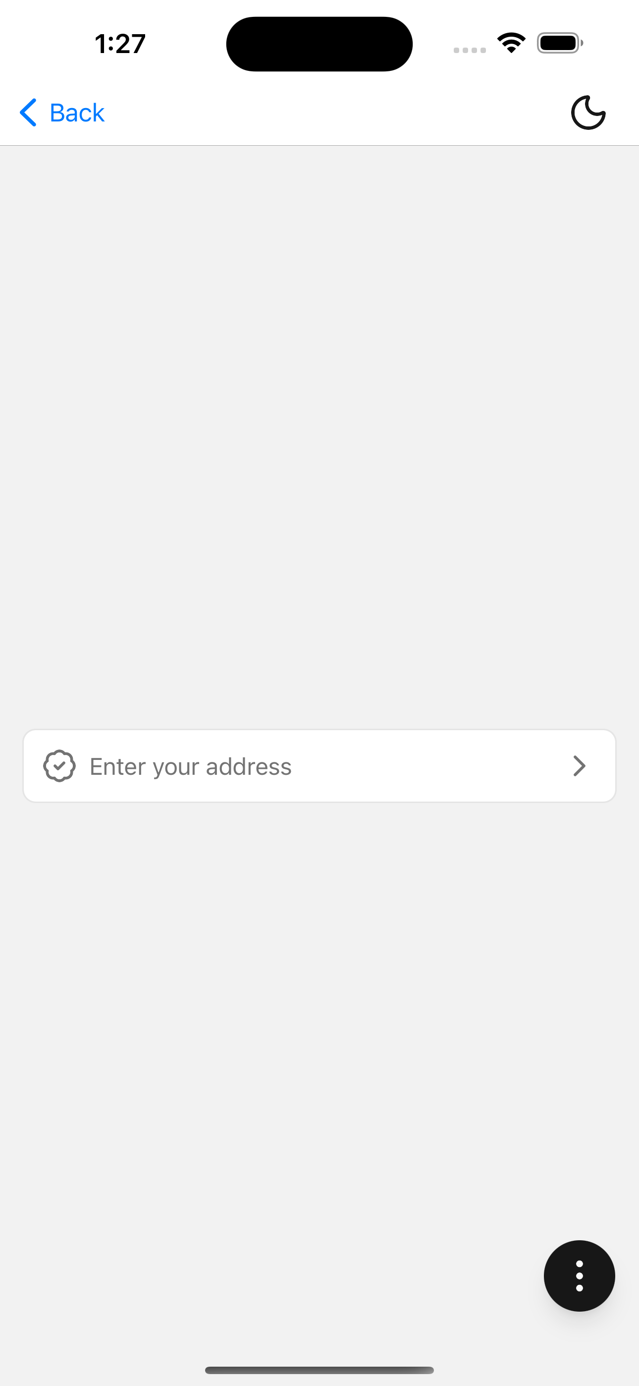
Add a leading icon or other addon content:
<ActionInput placeholder="Enter your address" value={address} onPress={openPicker}>
  <InputAddon>
    <InputAddonIcon>
      <BadgeCheckIcon />
    </InputAddonIcon>
  </InputAddon>
</ActionInput>
A chevron icon is rendered automatically on the trailing edge when no end addon is provided.
API Reference
ActionInput
Extends InputGroup. Displays value or placeholder as text (not an editable TextInput). A trailing chevron is rendered when no end addon is provided.
Prop
Type