OTP Input
A component for entering one-time passwords with individual character slots.
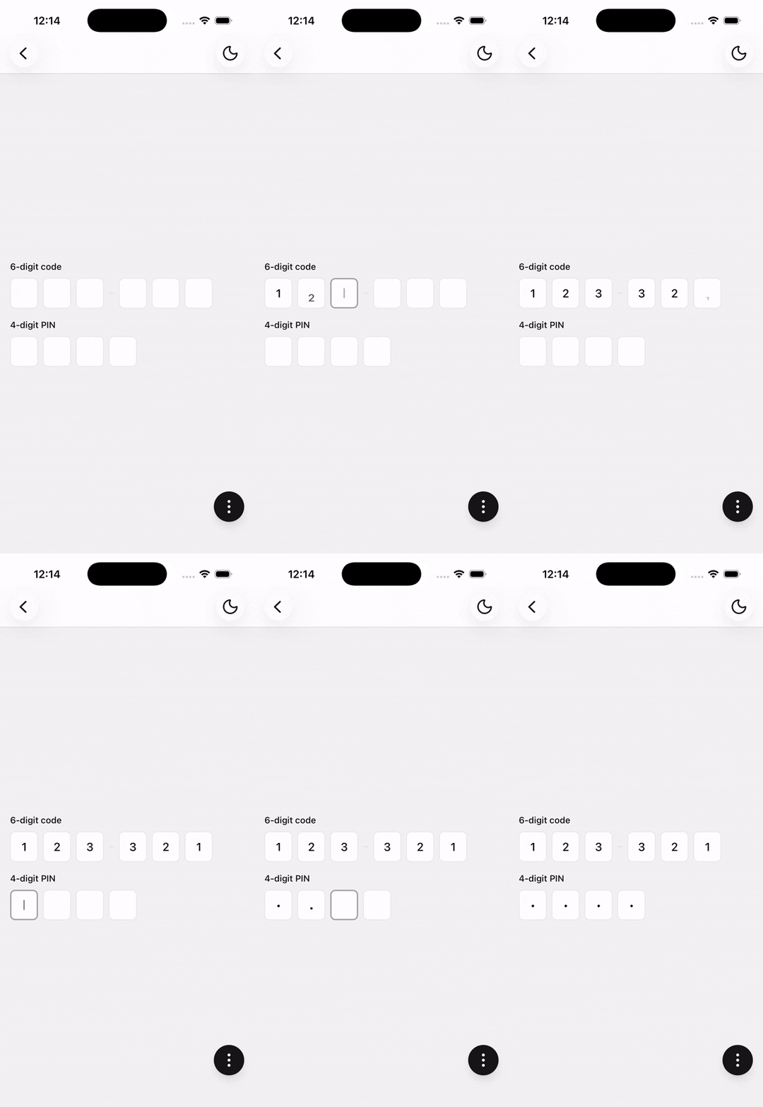
Installation
npx shadcn@latest add @tetra-ui/otp-inputUsage
The API mirrors shadcn Input OTP — InputOTP maps to OTPInput, InputOTPGroup to OTPInputGroup, and so on.
import {
  OTPInput,
  OTPInputGroup,
  OTPInputSeparator,
  OTPInputSlot,
} from "@/components/ui/otp-input";<OTPInput maxLength={6} onComplete={(code) => console.log(code)}>
<OTPInputGroup>
<OTPInputSlot index={0} />
<OTPInputSlot index={1} />
<OTPInputSlot index={2} />
</OTPInputGroup>
<OTPInputSeparator />
<OTPInputGroup>
<OTPInputSlot index={3} />
<OTPInputSlot index={4} />
<OTPInputSlot index={5} />
</OTPInputGroup>
</OTPInput>Four digits
A common pattern for PIN codes:
<OTPInput maxLength={4} secureTextEntry onComplete={(code) => console.log(code)}>
  <OTPInputSlot index={0} />
  <OTPInputSlot index={1} />
  <OTPInputSlot index={2} />
  <OTPInputSlot index={3} />
</OTPInput>
Controlled
const [value, setValue] = useState("");

<OTPInput maxLength={6} onChange={setValue} value={value}>
  <OTPInputGroup>
    <OTPInputSlot index={0} />
    <OTPInputSlot index={1} />
    <OTPInputSlot index={2} />
  </OTPInputGroup>
  <OTPInputSeparator />
  <OTPInputGroup>
    <OTPInputSlot index={3} />
    <OTPInputSlot index={4} />
    <OTPInputSlot index={5} />
  </OTPInputGroup>
</OTPInput>
Disabled
<OTPInput disabled maxLength={6}>
  <OTPInputGroup>
    <OTPInputSlot index={0} />
    <OTPInputSlot index={1} />
    <OTPInputSlot index={2} />
  </OTPInputGroup>
  <OTPInputSeparator />
  <OTPInputGroup>
    <OTPInputSlot index={3} />
    <OTPInputSlot index={4} />
    <OTPInputSlot index={5} />
  </OTPInputGroup>
</OTPInput>
Invalid
<OTPInput invalid maxLength={6}>
  <OTPInputGroup>
    <OTPInputSlot index={0} />
    <OTPInputSlot index={1} />
    <OTPInputSlot index={2} />
  </OTPInputGroup>
  <OTPInputSeparator />
  <OTPInputGroup>
    <OTPInputSlot index={3} />
    <OTPInputSlot index={4} />
    <OTPInputSlot index={5} />
  </OTPInputGroup>
</OTPInput>
Pattern
Restrict input to specific character patterns:
import { OTPInput, REGEXP_ONLY_DIGITS } from "@/components/ui/otp-input";

<OTPInput maxLength={6} pattern={REGEXP_ONLY_DIGITS}>
  <OTPInputGroup>
    <OTPInputSlot index={0} />
    <OTPInputSlot index={1} />
    <OTPInputSlot index={2} />
  </OTPInputGroup>
  <OTPInputSeparator />
  <OTPInputGroup>
    <OTPInputSlot index={3} />
    <OTPInputSlot index={4} />
    <OTPInputSlot index={5} />
  </OTPInputGroup>
</OTPInput>
Form
Use with Field and FieldControl for labels and validation:
import {
  Field,
  FieldControl,
  FieldErrorMessage,
  FieldLabel,
} from "@/components/ui/form";
import {
  OTPInput,
  OTPInputGroup,
  OTPInputSeparator,
  OTPInputSlot,
} from "@/components/ui/otp-input";

<Field errorMessage={error} invalid={!!error}>
  <FieldLabel>Verification code</FieldLabel>
  <FieldControl>
    <OTPInput maxLength={6} onChange={setValue} value={value}>
      <OTPInputGroup>
        <OTPInputSlot index={0} />
        <OTPInputSlot index={1} />
        <OTPInputSlot index={2} />
      </OTPInputGroup>
      <OTPInputSeparator />
      <OTPInputGroup>
        <OTPInputSlot index={3} />
        <OTPInputSlot index={4} />
        <OTPInputSlot index={5} />
      </OTPInputGroup>
    </OTPInput>
  </FieldControl>
  <FieldErrorMessage />
</Field>
API Reference
OTPInput
Root OTP field with its own prop surface (not a TextInput wrapper).
Prop
Type
OTPInputGroup
Extends React Native View props.
OTPInputSlot
Extends React Native Pressable props. Defaults children to placeholder, value, and caret.
Prop
Type
OTPInputSlotPlaceholder
Extends Text props. Falls back to placeholder[index] from OTPInput.
OTPInputSlotValue
Extends Text props. Falls back to the slot character (or • when secureTextEntry).
OTPInputSlotCaret
Extends Reanimated Animated.View props. Renders only when the slot is active and empty.
OTPInputSeparator
Extends React Native View props. Must be rendered under OTPInput.