Bottom Sheet
An interactive bottom sheet built on Expo UI with native snap points, gestures, and keyboard support.
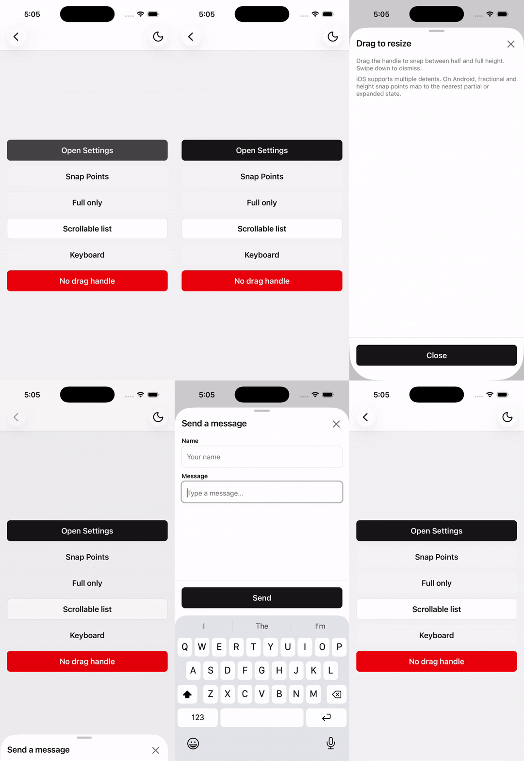
Bottom Sheet is built on @expo/ui native bottom sheets — SwiftUI on iOS and Jetpack Compose on Android. Use it for draggable snap points, scrollable content, keyboard-aware forms, or simple modal sheets.
Installation
npx shadcn@latest add @tetra-ui/bottom-sheetUsage
import { Button, ButtonText } from "@/components/ui/button";
import {
  BottomSheet,
  BottomSheetBody,
  BottomSheetClose,
  BottomSheetContent,
  BottomSheetFooter,
  BottomSheetHeader,
  BottomSheetTitle,
  BottomSheetTrigger,
} from "@/components/ui/bottom-sheet";<BottomSheet>
<BottomSheetTrigger asChild>
<Button>
<ButtonText>Open</ButtonText>
</Button>
</BottomSheetTrigger>
<BottomSheetContent>
<BottomSheetHeader>
<BottomSheetTitle>Bottom Sheet Title</BottomSheetTitle>
</BottomSheetHeader>
<BottomSheetBody>
<Text className="text-foreground">Bottom Sheet Body</Text>
</BottomSheetBody>
<BottomSheetFooter>
<BottomSheetClose asChild>
<Button>
<ButtonText>Close</ButtonText>
</Button>
</BottomSheetClose>
</BottomSheetFooter>
</BottomSheetContent>
</BottomSheet>Snap points
Pass Expo UI SnapPoint values to BottomSheetContent:
"half"— medium detent (iOS) / partial expansion (Android)"full"— large detent (iOS) / full expansion (Android){ fraction: 0.4 }— fractional height{ height: 320 }— fixed height in points
<BottomSheetContent snapPoints={[{ fraction: 1 / 3 }, "half", "full"]}>
  {/* ... */}
</BottomSheetContent>
Omit snapPoints to auto-size the sheet to its content.
On iOS, multiple detents are supported natively. On Android, fractional and height snap points map to the nearest partial or expanded state.
Scrollable content
Use BottomSheetScrollView for long lists. Place BottomSheetHeader as a sibling above the scroll view:
<BottomSheetContent snapPoints={["half", "full"]}>
  <BottomSheetHeader>
    <BottomSheetTitle>List</BottomSheetTitle>
  </BottomSheetHeader>
  <BottomSheetScrollView>
    {/* scrollable items */}
  </BottomSheetScrollView>
</BottomSheetContent>
Keyboard
The native sheet handles keyboard avoidance automatically. BottomSheetFooter stays above the keyboard without manual input hooks.
BottomSheetHeader, BottomSheetScrollView, and BottomSheetFooter must be direct children of BottomSheetContent (fragments are fine). On Android, children are split by component type so the footer can sit outside the scroll area in the Compose layout.
<BottomSheetContent snapPoints={["half", "full"]}>
  <BottomSheetHeader>
    <BottomSheetTitle>Send a message</BottomSheetTitle>
  </BottomSheetHeader>
  <BottomSheetScrollView>
    <TextInput placeholder="Message" />
  </BottomSheetScrollView>
  <BottomSheetFooter>
    <Button>Send</Button>
  </BottomSheetFooter>
</BottomSheetContent>
API Reference
BottomSheet
Root open state. Built on Expo UI BottomSheet (SwiftUI / Jetpack Compose). Controlled when open is set.
Prop
Type
BottomSheetTrigger
Extends React Native Pressable props. Opens the sheet on press. Must be used within BottomSheet.
Prop
Type
BottomSheetClose
Extends React Native Pressable props. Closes the sheet on press. Must be used within BottomSheet.
Prop
Type
BottomSheetContent
Extends React Native View props. Hosts the native sheet. Must be used within BottomSheet.
Prop
Type
BottomSheetHeader
Extends React Native View props. Renders children and a trailing close button.
BottomSheetTitle
Extends React Native Text props.
BottomSheetBody
Extends React Native View props. Padded sheet body region.
BottomSheetScrollView
Extends React Native ScrollView props. Sets nestedScrollEnabled and default content padding classes.
BottomSheetFooter
Extends React Native View props. Sticky footer with safe-area and keyboard padding.
Changelog
2026-09-16 - Slots integration
- Migrate to use
@tetra-ui/slotsfor slot management and allow for dynamic component composition.
2026-09-11 - Layout fixes
- Fixed layout issues with scrollable content
2026-07-08 - Expo UI rewrite
- Rebuilt on @expo/ui native bottom sheets (SwiftUI on iOS, Jetpack Compose on Android)
- Removed
BottomSheetPortal,BottomSheetOverlay,useBottomSheet,useBottomSheetAnimation, anduseBottomSheetInputHandlers - Snap points now use Expo UI
SnapPointformat ("half","full",{ fraction },{ height }) - No portal or overlay required — the native sheet is the modal
2026-06-22 - Keyboard Controller integration
- Added
react-native-keyboard-controlleras a dependency for footer keyboard avoidance on iOS.
2026-05-25 - Initial release
- Compound API:
BottomSheet,BottomSheetContent, and layout primitives - Snap points, pan-down-to-close, dynamic sizing
BottomSheetScrollView, stickyBottomSheetFooter