Inline List
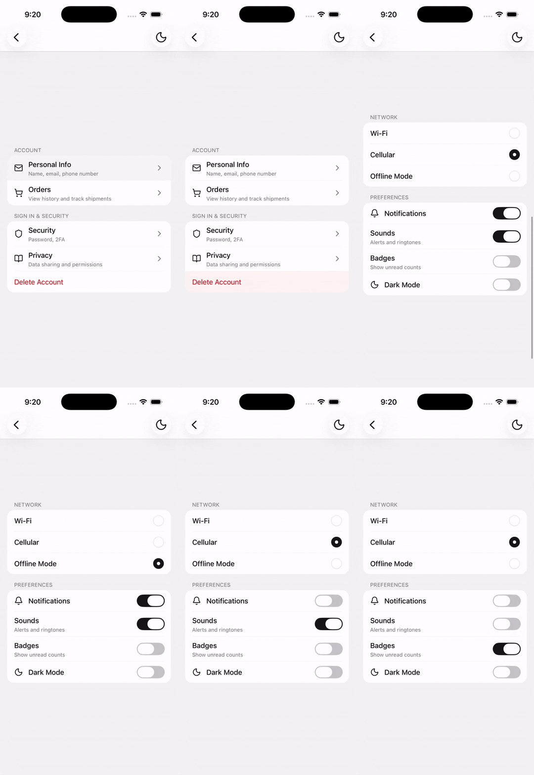
A grouped list section for settings-style rows with flexible leading and trailing addons.
Installation
npx shadcn@latest add @tetra-ui/inline-listUsage
import {
  InlineList,
  InlineListItem,
  InlineListItemDescription,
  InlineListItemTitle,
} from "@/components/ui/inline-list";<InlineList title="Account">
<InlineListItem onPress={() => {}}>
<InlineListItemTitle>Personal Info</InlineListItemTitle>
<InlineListItemDescription>
Name, email, phone number
</InlineListItemDescription>
</InlineListItem>
<InlineListItem onPress={() => {}}>
<InlineListItemTitle>Payment Methods</InlineListItemTitle>
<InlineListItemDescription>Visa ending in 4829</InlineListItemDescription>
</InlineListItem>
</InlineList>Separators between items are inserted automatically with a left inset. You do not need to add Separator components manually.
With Swipeable
Wrap rows in Swipeable (or any other wrapper) around InlineListItem. Separators still apply automatically because InlineList provides separator context to nested items:
import {
  Swipeable,
  SwipeableAction,
  SwipeableActionGroup,
  SwipeableContent,
} from "@/components/ui/swipeable";

<InlineList title="Inbox">
  <Swipeable>
    <SwipeableContent>
      <InlineListItem>
        <InlineListItemTitle>Message from Expo</InlineListItemTitle>
      </InlineListItem>
    </SwipeableContent>
    <SwipeableActionGroup edge="trailing">
      <SwipeableAction variant="destructive" onPress={() => {}}>
        Delete
      </SwipeableAction>
    </SwipeableActionGroup>
  </Swipeable>
</InlineList>
String children
Pass a string as InlineListItem children for a simple title-only row:
<InlineListItem onPress={() => {}}>Wi-Fi</InlineListItem>With icons
Use InlineListItemAddon with align="inline-start" or align="inline-end" to position leading or trailing content:
import {
  InlineListItemAddon,
  InlineListItemAddonIcon,
} from "@/components/ui/inline-list";
import { ChevronRightIcon, ShieldIcon } from "@/components/ui/icons";<InlineList title="Security">
<InlineListItem onPress={() => {}}>
<InlineListItemAddon align="inline-start">
<InlineListItemAddonIcon>
<ShieldIcon />
</InlineListItemAddonIcon>
</InlineListItemAddon>
<InlineListItemTitle>Two-Factor Auth</InlineListItemTitle>
<InlineListItemDescription>SMS and authenticator app</InlineListItemDescription>
<InlineListItemAddon align="inline-end">
<InlineListItemAddonIcon>
<ChevronRightIcon />
</InlineListItemAddonIcon>
</InlineListItemAddon>
</InlineListItem>
</InlineList>When a row has a leading addon, the separator inset aligns with the title text rather than under the icon.
Selection rows
Selection state is controlled by the consumer. Compose Radio or Checkbox in an inline-end addon:
import { Radio } from "@/components/ui/radio";<InlineList title="Network">
<InlineListItem
accessibilityRole="radio"
accessibilityState={{ selected: value === "wifi" }}
onPress={() => setValue("wifi")}
>
<InlineListItemTitle>Wi-Fi</InlineListItemTitle>
<InlineListItemAddon align="inline-end">
<Radio checked={value === "wifi"} />
</InlineListItemAddon>
</InlineListItem>
<InlineListItem
accessibilityRole="radio"
accessibilityState={{ selected: value === "cellular" }}
onPress={() => setValue("cellular")}
>
<InlineListItemTitle>Cellular</InlineListItemTitle>
<InlineListItemAddon align="inline-end">
<Radio checked={value === "cellular"} />
</InlineListItemAddon>
</InlineListItem>
</InlineList>Static rows
Omit onPress to render a non-interactive row — useful for trailing controls such as Switch:
import { Switch } from "@/components/ui/switch"; <InlineListItem>
<InlineListItemTitle>Notifications</InlineListItemTitle>
<InlineListItemAddon align="inline-end">
<Switch onValueChange={setEnabled} value={enabled} />
</InlineListItemAddon>
</InlineListItem>Destructive row
Use variant="destructive" on InlineListItem for destructive actions such as sign out or delete account. The title is rendered in destructive color with a matching press highlight:
<InlineListItem onPress={() => {}} variant="destructive">
  <InlineListItemTitle>Delete Account</InlineListItemTitle>
</InlineListItem>
Multiple sections
Stack multiple InlineList components with section titles:
<Stack gap="lg">
  <InlineList title="Account">{/* ... */}</InlineList>
  <InlineList title="Preferences">{/* ... */}</InlineList>
</Stack>
Suppress a separator
Pass showSeparator={false} on a specific item to hide the divider below it:
<InlineListItem showSeparator={false} onPress={() => {}}>
  Last item without a trailing separator
</InlineListItem>
API Reference
InlineList
Extends React Native View props. Provides separator context to nested InlineListItems (all but the last direct child).
Prop
Type
InlineListItem
Extends React Native Pressable props when onPress is set; otherwise renders a non-pressable row.
Prop
Type
InlineListItemTitle
Extends React Native Text props. Colored from the parent item variant.
InlineListItemDescription
Extends React Native Text props.
InlineListItemAddon
Extends React Native View props.
Prop
Type
InlineListItemAddonIcon
Clones a single child icon with size and color from item/addon context.
Prop
Type
Changelog
2026-08-12
- Added
Swipeablesupport toInlineListrows.
2026-06-29
- Added
variantprop toInlineListItemfor destructive actions.