Alert
Displays a callout for user attention.
Installation
npx shadcn@latest add @tetra-ui/alertUsage
import {
  Alert,
  AlertDescription,
  AlertIcon,
  AlertTitle,
} from "@/components/ui/alert";
import { InfoIcon } from "@/components/ui/icons";<Alert>
<AlertIcon>
<InfoIcon />
</AlertIcon>
<AlertTitle>Heads up!</AlertTitle>
<AlertDescription>
You can add components and dependencies to your app using the cli.
</AlertDescription>
</Alert>Composition
Alert
├── AlertIcon
├── AlertTitle
├── AlertDescription
└── AlertAction
Variants
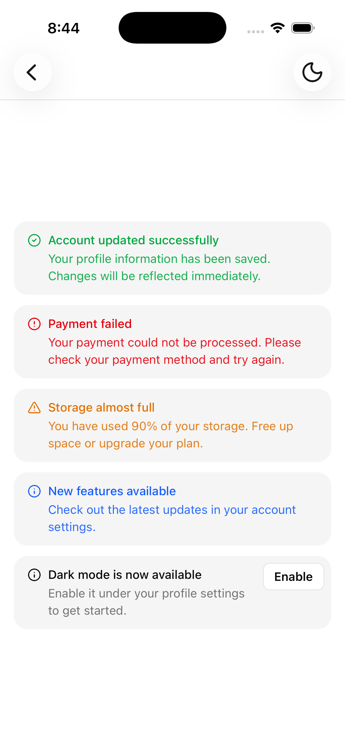
Use variant to change the alert's visual style. Available variants: default, destructive, success, warning, and info.
import {
  CircleAlertIcon,
  CircleCheckIcon,
  InfoIcon,
  TriangleAlertIcon,
} from "@/components/ui/icons";

<Alert variant="destructive">
  <AlertIcon>
    <CircleAlertIcon />
  </AlertIcon>
  <AlertTitle>Payment failed</AlertTitle>
  <AlertDescription>
    Your payment could not be processed. Please check your payment method and
    try again.
  </AlertDescription>
</Alert>

<Alert variant="success">
  <AlertIcon>
    <CircleCheckIcon />
  </AlertIcon>
  <AlertTitle>Account updated successfully</AlertTitle>
  <AlertDescription>
    Your profile information has been saved. Changes will be reflected
    immediately.
  </AlertDescription>
</Alert>

<Alert variant="warning">
  <AlertIcon>
    <TriangleAlertIcon />
  </AlertIcon>
  <AlertTitle>Storage almost full</AlertTitle>
  <AlertDescription>
    You have used 90% of your storage. Free up space or upgrade your plan.
  </AlertDescription>
</Alert>

<Alert variant="info">
  <AlertIcon>
    <InfoIcon />
  </AlertIcon>
  <AlertTitle>New features available</AlertTitle>
  <AlertDescription>
    Check out the latest updates in your account settings.
  </AlertDescription>
</Alert>
Action
Use AlertAction to add a button or other action element to the alert.
import { Button } from "@/components/ui/button";

<Alert>
  <AlertIcon>
    <InfoIcon />
  </AlertIcon>
  <AlertTitle>Dark mode is now available</AlertTitle>
  <AlertDescription>
    Enable it under your profile settings to get started.
  </AlertDescription>
  <AlertAction>
    <Button className="w-fit" size="sm" variant="outline">
      Enable
    </Button>
  </AlertAction>
</Alert>
API Reference
Alert
Extends React Native View props. Positions AlertIcon and AlertAction slots automatically.
Prop
Type
AlertIcon
Clones a single child icon with size and color from the parent Alert context. Must be used within Alert.
Prop
Type
AlertTitle
Extends React Native Text props. Must be used within Alert.
AlertDescription
Extends React Native Text props. Must be used within Alert.
AlertAction
Extends React Native View props. Absolutely positioned in the top-right of the alert.
Changelog
2026-09-16 - Slots integration
- Migrate to use
@tetra-ui/slotsfor slot management and allow for dynamic component composition.