Native Select
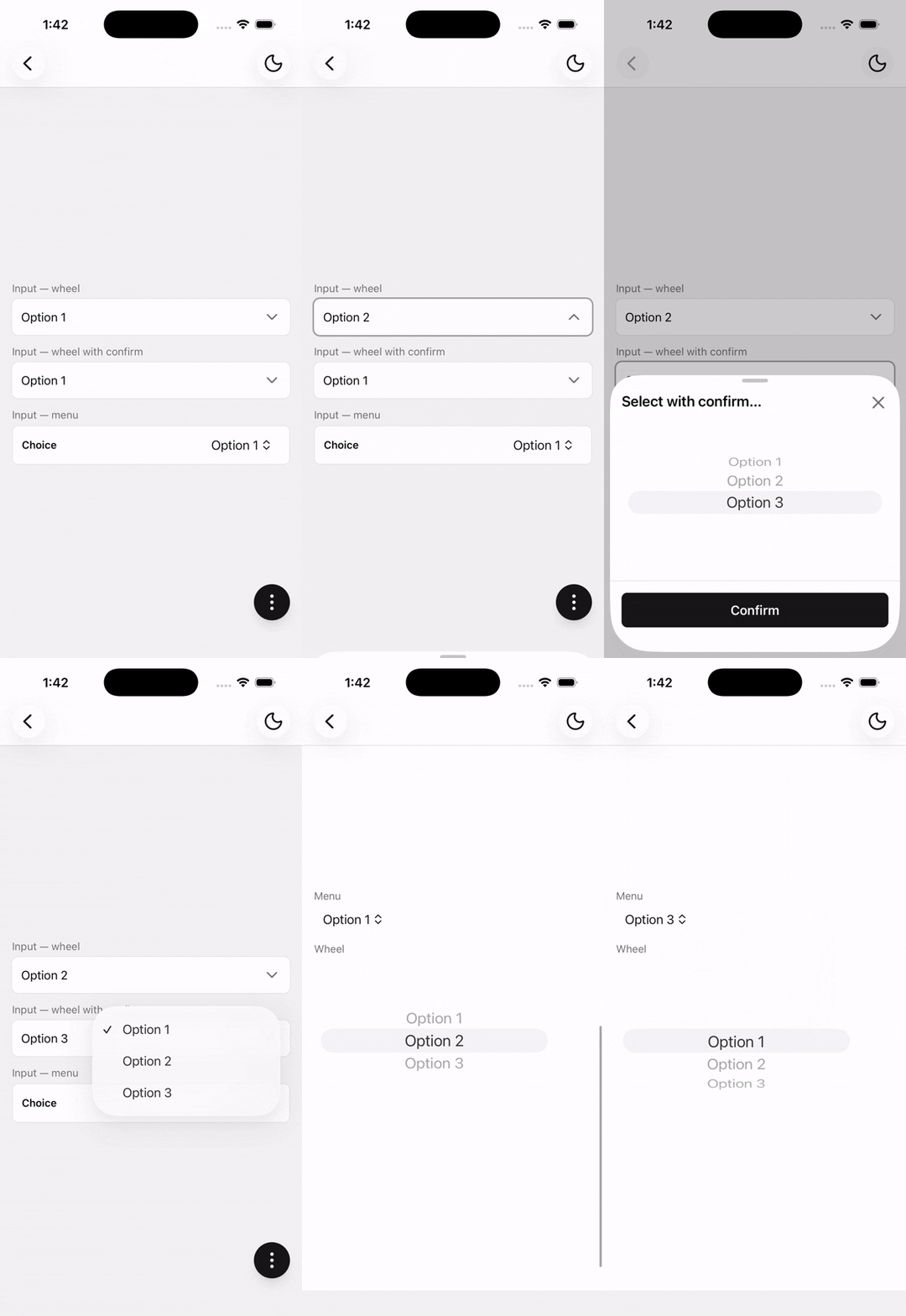
A native single-selection input built on Expo UI Picker, with optional form-styled input and platform-aware presentation.
Native Select wraps Expo UI's Picker.
Installation
npx shadcn@latest add @tetra-ui/native-selectUsage
Menu and wheel
Use Content alone to render the Expo Picker inline. Set variant on the root (menu or wheel). variant="wheel" is iOS-only; on Android it falls back to the platform menu.
import {
  NativeSelect,
  NativeSelectContent,
  NativeSelectItem,
} from "@/components/ui/native-select";
const [value, setValue] = useState("1");
<NativeSelect variant="menu" value={value} onValueChange={setValue}>
<NativeSelectContent>
<NativeSelectItem label="Option 1" value="1" />
<NativeSelectItem label="Option 2" value="2" />
<NativeSelectItem label="Option 3" value="3" />
</NativeSelectContent>
</NativeSelect><NativeSelect variant="wheel" value={value} onValueChange={setValue}>
<NativeSelectContent>
<NativeSelectItem label="Option 1" value="1" />
<NativeSelectItem label="Option 2" value="2" />
<NativeSelectItem label="Option 3" value="3" />
</NativeSelectContent>
</NativeSelect>Form-styled select
Compose NativeSelectTrigger, NativeSelectInput, and NativeSelectContent like Select. The Trigger opens the picker; Input is display-only; Content owns the sheet/menu and hosts items. Content has no props — the sheet title follows the Input placeholder.
Use variant on Input to choose the iOS presentation:
wheel(default) — Trigger opens a bottom sheet containing a wheel pickermenu— non-pressable input; only the native menu picker is tappable (Trigger optional)- Android — Trigger anchors an
ExposedDropdownMenuBox.variantis ignored.
Pass InputAddon children to Input for adornments. On iOS wheel, optionally compose NativeSelectSheetFooter and NativeSelectSheetConfirm inside Content to require an explicit confirm before committing (dismiss cancels).
import { Button } from "@/components/ui/button";
import {
  NativeSelect,
  NativeSelectContent,
  NativeSelectInput,
  NativeSelectItem,
  NativeSelectSheetConfirm,
  NativeSelectSheetFooter,
  NativeSelectTrigger,
} from "@/components/ui/native-select";
import { InputAddon, InputAddonIcon } from "@/components/ui/input";
import { SearchIcon } from "@/components/ui/icons";<NativeSelect value={value} onValueChange={setValue}>
<NativeSelectTrigger asChild>
<NativeSelectInput placeholder="Select...">
<InputAddon align="inline-start">
<InputAddonIcon>
<SearchIcon />
</InputAddonIcon>
</InputAddon>
</NativeSelectInput>
</NativeSelectTrigger>
<NativeSelectContent>
<NativeSelectItem label="Option 1" value="1" />
<NativeSelectItem label="Option 2" value="2" />
<NativeSelectItem label="Option 3" value="3" />
<NativeSelectSheetFooter>
<NativeSelectSheetConfirm asChild>
<Button>Confirm</Button>
</NativeSelectSheetConfirm>
</NativeSelectSheetFooter>
</NativeSelectContent>
</NativeSelect><NativeSelect value={value} onValueChange={setValue}>
<NativeSelectInput variant="menu" placeholder="Select..." />
<NativeSelectContent>
<NativeSelectItem label="Option 1" value="1" />
<NativeSelectItem label="Option 2" value="2" />
<NativeSelectItem label="Option 3" value="3" />
</NativeSelectContent>
</NativeSelect>Without a sheet footer, iOS wheel commits the value as it changes.
Custom trigger
Use any pressable as the Trigger child via asChild:
import { Button, ButtonText } from "@/components/ui/button";
import {
  NativeSelect,
  NativeSelectContent,
  NativeSelectItem,
  NativeSelectTrigger,
} from "@/components/ui/native-select";<NativeSelect value={value} onValueChange={setValue}>
<NativeSelectTrigger asChild>
<Button size="sm" variant="secondary">
<ButtonText>{label ?? "Select"}</ButtonText>
</Button>
</NativeSelectTrigger>
<NativeSelectContent>
<NativeSelectItem label="Option 1" value="1" />
<NativeSelectItem label="Option 2" value="2" />
<NativeSelectItem label="Option 3" value="3" />
</NativeSelectContent>
</NativeSelect>Controlled
Pass value and onValueChange for controlled selection. On iOS, optionally control open and onOpenChange for the sheet:
const [value, setValue] = useState("1");
const [open, setOpen] = useState(false);

<NativeSelect
  value={value}
  onValueChange={setValue}
  open={open}
  onOpenChange={setOpen}
>
  <NativeSelectTrigger asChild>
    <NativeSelectInput placeholder="Select..." />
  </NativeSelectTrigger>
  <NativeSelectContent>
    <NativeSelectItem label="Option 1" value="1" />
    <NativeSelectItem label="Option 2" value="2" />
  </NativeSelectContent>
</NativeSelect>
Disabled
<NativeSelect disabled value={value} onValueChange={setValue}>
  <NativeSelectTrigger asChild>
    <NativeSelectInput placeholder="Select..." />
  </NativeSelectTrigger>
  <NativeSelectContent>
    <NativeSelectItem label="Option 1" value="1" />
    <NativeSelectItem label="Option 2" value="2" />
  </NativeSelectContent>
</NativeSelect>
API Reference
Built on Expo UI Picker. Always include NativeSelectContent. Content-only renders the picker inline; with Trigger/Input, uses a form-styled input and platform presentation.
NativeSelect
Root value/open state. Value type is Expo UI PickerItemValue (string | number).
Prop
Type
NativeSelectItem
Alias of Expo UI Picker.Item.
Prop
Type
NativeSelectTrigger
Opens the sheet/menu. Extends React Native Pressable props. Must be used within NativeSelect.
Prop
Type
NativeSelectInput
Display-only form-styled input. Compose inside NativeSelectTrigger for wheel/Android. iOS menu embeds the native menu picker and does not need a Trigger.
Prop
Type
NativeSelectContent
Always required. Owns presentation: inline picker, iOS wheel bottom sheet, or Android ExposedDropdownMenu. Hosts NativeSelectItem children and optional sheet footer. No props — sheet title follows the Input placeholder.
NativeSelectSheetFooter
Accepts BottomSheetFooter props. When present on iOS wheel, picker changes are drafted until confirm; dismiss cancels.
NativeSelectSheetConfirm
Extends React Native Pressable props. Commits the draft value and closes the sheet. Must be used within NativeSelect.
Prop
Type
Changelog
2026-09-16 - Slots integration
- Migrate to use
@tetra-ui/slotsfor slot management and allow for dynamic component composition.
2026-08-04 - Trigger and Content composition
Add NativeSelectTrigger and NativeSelectContent. NativeSelectInput is display-only; open the picker via Trigger (or use any pressable with asChild). Items and sheet footer move into Content.
2026-08-05 - Mandatory Content and variant
NativeSelectContent is required for all usage. Renamed appearance to variant. Content takes no props (sheet title follows Input placeholder).