Form
Components and utilities that help you compose forms.
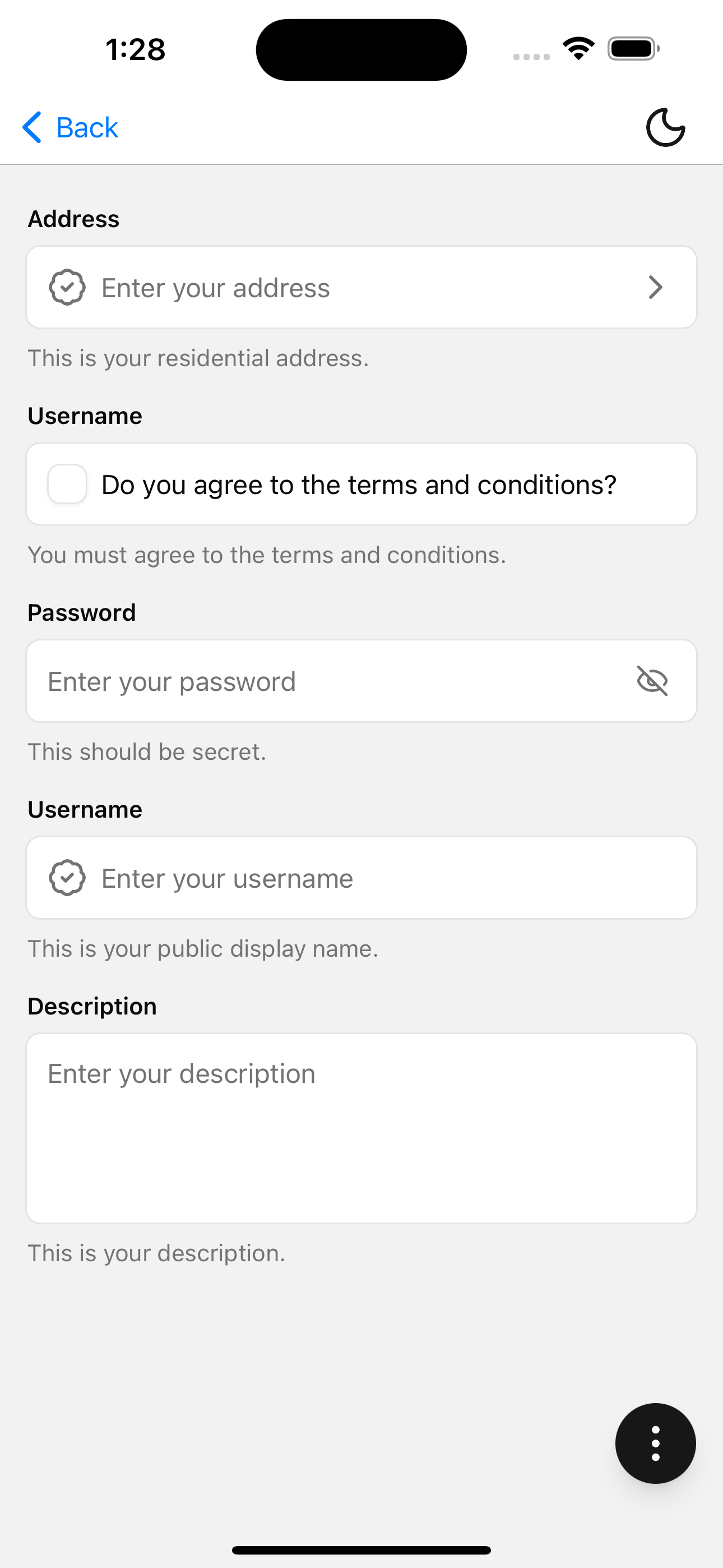
Installation
npx shadcn@latest add @tetra-ui/formUsage
import {
  Field,
  FieldControl,
  FieldDescription,
  FieldErrorMessage,
  FieldLabel,
} from "@/components/ui/form";
import { TextInput } from "@/components/ui/text-input";<Field>
<FieldLabel>Username</FieldLabel>
<FieldControl>
<TextInput placeholder="Enter your username" />
</FieldControl>
<FieldDescription>This is your public display name.</FieldDescription>
<FieldErrorMessage />
</Field>React Hook Form
import { zodResolver } from "@hookform/resolvers/zod";
import { Button } from "@/components/ui/button";
import {
  Field,
  FieldControl,
  FieldErrorMessage,
  FieldLabel,
  validateField,
} from "@/components/ui/form";
import { PasswordInput } from "@/components/ui/password-input";
import { TextInput } from "@/components/ui/text-input";
import { Controller, useForm } from "react-hook-form";
import { z } from "zod";
const formSchema = z.object({
  username: z.string(),
  password: z.string(),
});

const Form = () => {
  const form = useForm({
    resolver: zodResolver(formSchema),
  });

  const onSubmit = (data: z.infer<typeof formSchema>) => {
    console.log(data);
  };
  return (
    <>
      <Controller
        control={form.control}
        name="username"
        render={({ field, formState }) => (
          <Field {...validateField(formState.errors, "username")}>
            <FieldLabel>Username</FieldLabel>
            <FieldControl>
              <TextInput
                onChangeText={field.onChange}
                placeholder="Enter your username"
                value={field.value}
              />
            </FieldControl>
            <FieldErrorMessage />
          </Field>
        )}
      />
      <Controller
        control={form.control}
        name="password"
        render={({ field, formState }) => (
          <Field {...validateField(formState.errors, "password")}>
            <FieldLabel>Password</FieldLabel>
            <FieldControl>
              <PasswordInput
                onChangeText={field.onChange}
                placeholder="Enter your password"
                value={field.value}
              />
            </FieldControl>
            <FieldErrorMessage />
          </Field>
        )}
      />

      <Button onPress={form.handleSubmit(onSubmit)}>Submit</Button>
    </>
  );
};
API Reference
Companion components for react-hook-form. There is no Form provider export — use RHF's useForm / Controller (or FormProvider) and wire field state into Field.
Field
Root field state for label, control, description, and error message.
Prop
Type
FieldLabel
Extends Label props. Reads invalid / disabled from Field.
FieldControl
Clones a single child and passes disabled and invalid from Field.
Prop
Type
FieldDescription
Extends React Native Text props. Hidden when errorMessage is set on Field.
FieldErrorMessage
Extends React Native Text props (children omitted). Renders errorMessage from Field with accessibilityRole="alert".
Changelog
2026-01-02 - Remove lodash dependency
lodash has been removed as a dependency since react-hook-form provides its own utility function get.
2025-12-06 - Displaying error messages
FieldDescription now automatically hides when an error message is present.